
Vrbo Rebrand
Vrbo
After 25 years, just about anything can start to feel a bit stale. That’s exactly what happened to the VRBO brand. So, we did a whole bunch of market research and dove into all the data we could find, and something pretty interesting revealed itself. VRBO had a ton of brand equity built up over all those years, it just needed a little refresh—something to infuse more energy and a modern feel into the brand. So, we embarked on designing a new brand identity with FÖDA Studio to bring VRBO into a new era, the era of Vrbo.

A Whole New Identity & Design System
Indexing thousands of images of “vacation”, we noticed a pattern—parallel paths. Whether it be jet streams in the sky, a striped umbrella on the Amalfi coast, or the rows of windows lining the canals in Amsterdam, all are a part of vacation. We took this essence and created a brand identity full of life that strategically positioned Vrbo opposite the other guys.

Everything about the new identity is inspired by travel and represents the paths that bring people together
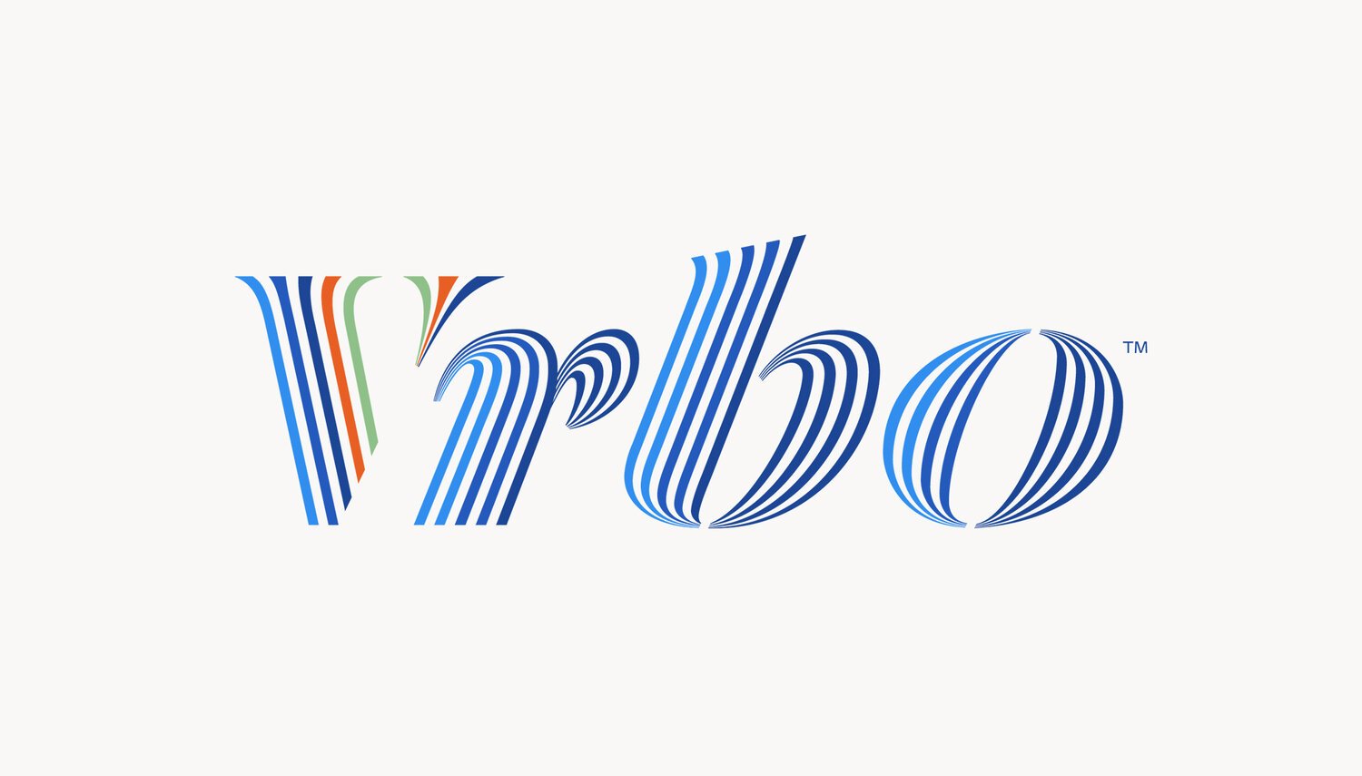
V Is For Vacation
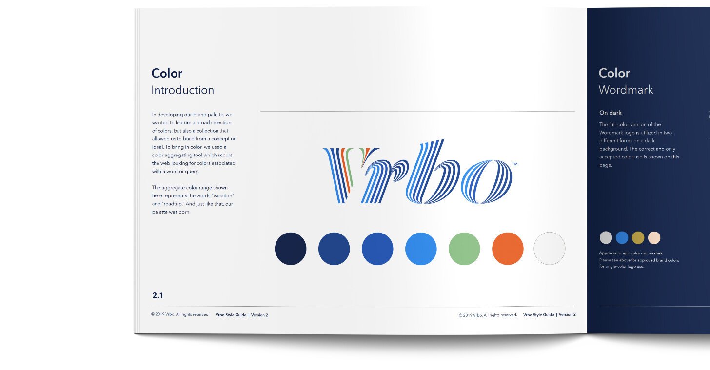
The new palette represents the vibrant colors of vacation—ocean, skies, sunsets, sand and wilderness.
A Vision In Full Color
Through research and data we found that “ver-boh” is easier to remember and to say in other languages.
Brand Name Evolution

Designed to represent the fluid connectivity between ourselves and the places we travel.
Visual Inspiration

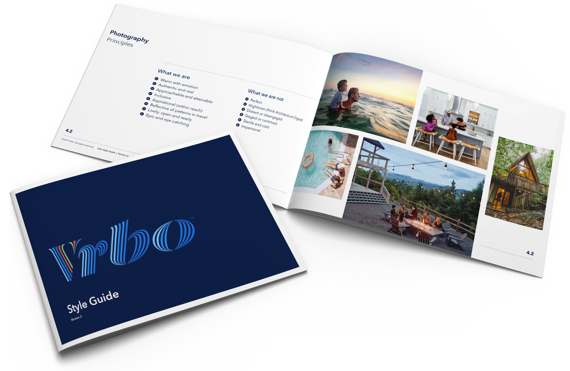
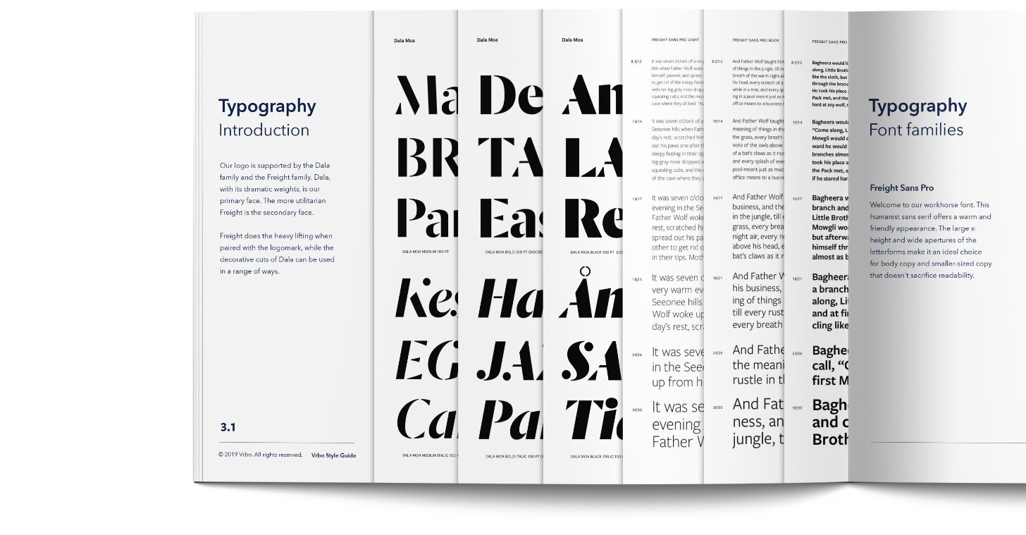
For our new identity, we created a beautiful system for the brand to live and grow within.
Style Guide


Agency Partner / FÖDA Studio